Software Development in 2026: How I built this site
In July my work ran a step-count challenge. I bought a WalkingPad, shoved it under my standing desk, and walked while I worked. The challenge ended a few weeks later and I just kept walking.
I didn’t want a template
The easy version of this is to grab a portfolio template, swap in your name, and ship the same page as everybody else. I wanted the site itself to be the thing worth looking at, instead of a nice frame around a list of links.
The problem is that I’m not a designer. What I can do is go find pictures, so I spent an evening browsing Canva samples: searching resume, landing page, tech landing page, treadmill stickman, graph paper canvas; I found some that looked good and saved the handful that made me stop scrolling.
Three of them ended up doing all the work.

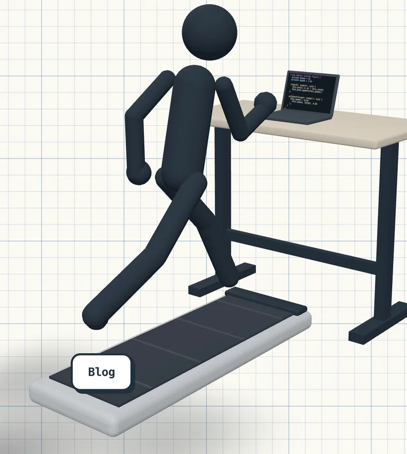
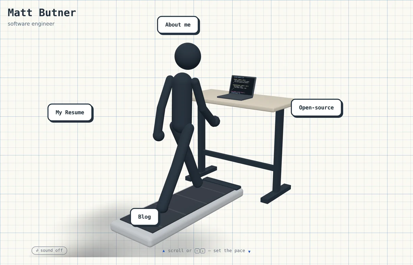
The first was a white 3D stick figure running on a treadmill. Faceless, rounded, abstract. That one made it in almost unchanged. The second was a short animation of a hand-drawn graph paper canvas, which turned into the background of every page here. The third was a minimal graphic of a mouse with chevrons above and below it, which became the little scroll prompt sitting under the treadmill.
repeating-linear-gradients, no image.Three images, three features. Design has never gone that cleanly for me before, and I’m fairly sure the reason is that I showed up with pictures instead of adjectives.
How I designed it
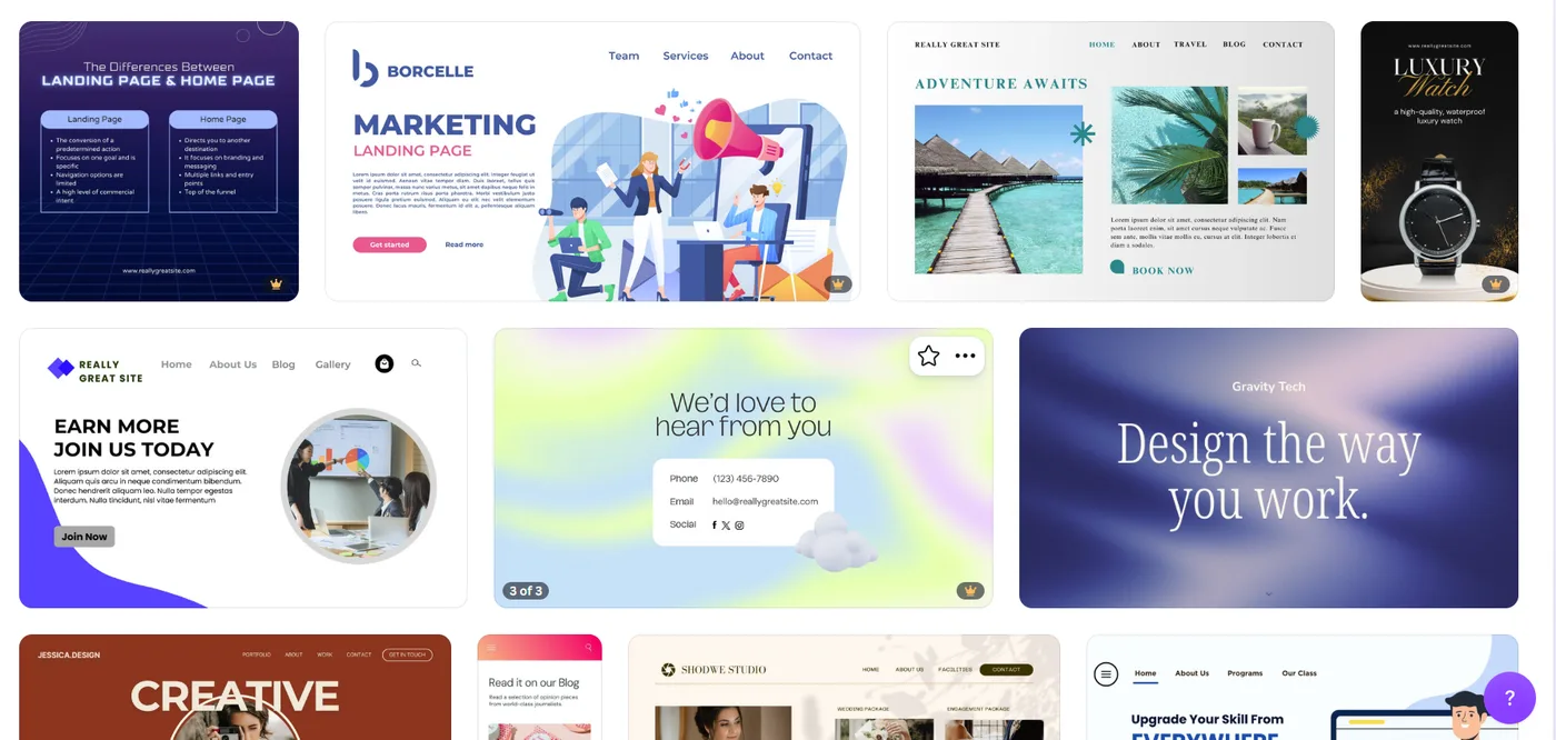
I dumped the samples into a Claude chat with Opus 5 and talked through what I wanted: the feel, plus the parts I’d already decided on, like Three.js for the hero and the notebook look for everything else.
It’s worth showing how I actually curated the prompt that built this website. During the design phase I was uploading image samples to Opus 5 and describing what I wanted. After we settled on a “hub style landing page” (Claude’s words, not mine) I narrowed down the requirements and described what I wanted in plain words:
Alright, I like your idea behind the "Hub" style landing page, where it at least introduces your name and brief intro, then has navigation options for resume, about me, blog, etc.
I've been looking at open source Graphic Designs (think Canva) and found some inspiration for how I want to present my brand.
I've attached two files: one is a video and the other is an image. I want you to use these attached files for inspiration and to get an idea of what it is I want. By no means should Fable literally use the files I'm attaching.
Here's the context: In the month of July my workplace had a challenge to get the highest number of steps for the month, so I purchased a WalkingPad treadmill which I used almost every day while working at my home office (and it's a habit I continue to follow to get my steps in). Would be quite cool to have an abstract style stick figure (3D, built in ThreeJS) walking on a treadmill, behind a stand-up desk that's holding a laptop with object-oriented code on the screen.
The canvas for this landing page would look like Graph Paper (from Math class). So you have a pretty clean template, it's just a big sheet of graph paper with this software engineer stick figure walking while writing code.
Bonus points: When the page initially loads, the animation (ThreeJS) fades in, and you see an Up / Down scroll prompt which signals to the user, scroll up to see the stick figure run faster (and the animation then runs faster). Scroll down to slow down (and then the animation slows down). Also when the stickman loads, the four buttons: "About me", "My Resume", "Open-source" are arranged in a triangle with Stickman in the middle. These three buttons are not initially visible as the animation loads: the stickman will "snap" his glance at the button's position to reveal it! The buttons themselves are very native looking buttons, with beautiful hover and satisfying sounds when hovering/clicking on it (think of Toontown in 2006 with that digital crack style of UX design).
I think this Landing Page / SWE Portfolio concept is one of a kind and would be phenomenal if we could pull it off. I will be taking out the big guns since this is a complicated ask. The tech stack for this web portfolio is not super strict, but I would assume React, ThreeJS, some CSS is what we need? What I need from you is the following:
1) Based on these novel requirements, let's figure out the right frontend stack
2) Using all of this context, generate a prompt I can pass off to Fable within Claude CLI to handle this project
3) Let me know if there's any other useful context / instructions (maybe file examples to help with the ThreeJS animations??)
A few more things got settled in the back-and-forth after that.
Hosting, which is the one people push back on. This project started on a homelab night. I’d spent the evening putting Proxmox on a Beelink SER8. I was very eager to self-host this website, but I decided against it. Cloudflare Pages is not only free, but it will beat my house on uptime forever.
A procedural figure instead of a rigged model. Mixamo would have handed me a rigged humanoid and a walk clip in five minutes. I passed, partly because it drags in a realistic human silhouette and a multi-megabyte model file, and partly because building the guy out of spheres and capsules driven by sine waves makes the interaction nearly free.
Buttons as DOM, not 3D. They render through drei’s <Html>, so they’re
real anchors with real focus rings and real tab order. Extruded 3D text would
photograph better and be worse at everything else.
Then Opus 5 came back, condensing all of that into a prompt I could pass off to Fable. It opens by pinning down the stack, which was the part I’d been vaguest about:
STACK — use exactly this:
- Astro (static output) as the site framework
- React island for the 3D hero only, via client:only="react"
- @react-three/fiber + @react-three/drei for Three.js
- Plain CSS (or CSS modules). No Tailwind, no UI library.
- Deploys to Cloudflare Pages as static files. No SSR, no server runtime.
The whole thing is about a page and a half. Every section reads like that: the scene described in specifics, a seven-stage build order, and a hard rule at the bottom about not adding dependencies without asking.
The full build prompt, if you want it
I'm building a personal software-engineering portfolio. The landing page is
an interactive 3D hero scene; the rest of the site is a content hub
(About, Resume, Open-source, Blog).

STACK — use exactly this:
- Astro (static output) as the site framework
- React island for the 3D hero only, via client:only="react"
- @react-three/fiber + @react-three/drei for Three.js
- Plain CSS (or CSS modules). No Tailwind, no UI library.
- Deploys to Cloudflare Pages as static files. No SSR, no server runtime.

THE HERO SCENE
A minimalist 3D stick figure walks on a WalkingPad-style treadmill,
positioned behind a standing desk holding an open laptop. The laptop
screen displays scrolling object-oriented code. The whole thing sits on
a graph-paper background — the kind from a math notebook.

Build the graph paper in CSS (repeating-linear-gradient), NOT as a texture
or 3D plane. The canvas renders with a transparent background and sits on
top of it. Use drei's <ContactShadows> so the figure and furniture cast a
soft shadow onto the paper — that's what makes it feel grounded rather
than pasted on.

THE FIGURE — build procedurally, do not load a model:
- Spheres and capsules only: head, torso, two arms, two legs. Abstract
  and simple, like a 3D stick figure. No face, no hands, no detail.
- Animate the walk cycle procedurally with sine waves driven by a single
  `phase` value advanced in useFrame. Limb rotation, slight torso bob,
  slight arm counter-swing.
- Walk speed = how fast `phase` advances. This must be a single
  controllable value, because scroll changes it.
- At higher speeds, shift the pose toward a run: more lean, higher knee
  lift, wider arm swing. Interpolate smoothly — no discrete
  walk/run states.

SCROLL-TO-SPEED INTERACTION
- Scroll up increases walk speed, scroll down decreases it.
- Show an animated up/down scroll prompt on load to signal the mechanic.
- CRITICAL: this must not trap the user. Only capture wheel events while
  the hero fills the viewport AND window.scrollY === 0. Once speed is at
  maximum, or after a downward-scroll threshold at minimum speed, release
  the wheel and let the page scroll normally. Test this carefully — a
  landing page the user can't scroll past is a total failure.
- Mobile has no wheel: provide a visible speed slider or drag control
  as an equivalent affordance.
- Ease the speed value toward its target rather than snapping.

BUTTON REVEAL SEQUENCE
- Four navigation buttons — About me, My Resume, Open-source, Blog —
  arranged in a diamond around the figure. (If you think three in a
  triangle composes better, say so before building.)
- Buttons start invisible. On load, after the scene fades in, the figure
  snaps its head to look at each button position in turn; each button
  fades/pops in as the glance lands on it.
- Implement the glance as head rotation toward the button's 3D position,
  with a quick snap and a slight settle/overshoot. Sequence them with a
  short stagger.
- Render buttons as DOM via drei's <Html>, not as 3D geometry.

BUTTON FEEL — this matters, don't make them generic:
- Chunky, tactile, slightly over-animated. Reference point: mid-2000s
  web game UI (Toontown, Club Penguin) — bouncy scale on hover, a
  satisfying press-down on click, thick borders, high contrast.
- Must still look intentional next to a clean graph-paper aesthetic.
  Playful, not childish.
- Hover and click sounds. Synthesize these with the Web Audio API using
  oscillators — short blips, no audio files. Keeps the bundle at zero
  extra bytes and lets me tune them.
- Audio must not attempt to play before a user gesture (browsers block
  it). Unlock the AudioContext on first interaction.
- Include a persistent mute toggle. Sound must default to OFF.

ACCESSIBILITY AND FALLBACKS — required, not optional:
- Respect prefers-reduced-motion: render a static posed scene, no walk
  cycle, no scroll mechanic, buttons visible immediately.
- Buttons are real focusable elements with keyboard navigation and
  visible focus states. The entire nav must work without the 3D scene.
- If WebGL is unavailable, fall back to the graph-paper background with
  the buttons laid out normally.
- Lazy-load the 3D island; don't block first paint on it.

THE REST OF THE SITE
Standard Astro pages: About, Resume, Open-source, Blog (markdown
collection). Keep these clean and simple — the hero is the personality,
the content pages should be readable and fast. Reuse the graph-paper
motif lightly as an accent, not a full background.

BUILD ORDER — please follow this:
1. Astro scaffold, routes, graph-paper CSS background. No 3D yet.
2. Static 3D scene: figure, treadmill, desk, laptop, contact shadows.
3. Procedural walk cycle with a hardcoded speed value.
4. Scroll-to-speed, including the release logic.
5. Button reveal sequence and glance animation.
6. Button styling and Web Audio sounds.
7. Reduced-motion and no-WebGL fallbacks.

Show me each stage before moving to the next.

Ask before adding any dependency beyond astro, react, react-dom,
@react-three/fiber, @react-three/drei, and three.
Read my button paragraph again and you’ll catch something I didn’t. I asked for “the four buttons” and then listed three of them, in a triangle. The exported version has four in a diamond, plus a question aimed back at me: (If you think three in a triangle composes better, say so before building.) Blog was the one I’d dropped. That’s a spec bug that costs you a rebuild, and it got caught because something read what I wrote before building it.
It’s tempting to sell the two-model thing as the designer AI handing off to the builder AI, but neither model is specialized and that’s not really what happened. The boring version is more useful: a long exploratory conversation accumulates a lot of context, that context is expensive to rebuild, and writing it down is worth doing no matter who reads it next. A different model, a coworker, or me in a couple months.
How hard would this be to build pre-LLM?
I kept coming back to that, and the answer isn’t “impossible.” There’s nothing here I couldn’t have built. It’s more that I wouldn’t have.
Pre-AI, the learning curve for anything like this was the whole job. I have a data point on that, because I already did it once. Here’s the portfolio I built as a college student, years before any of this existed:
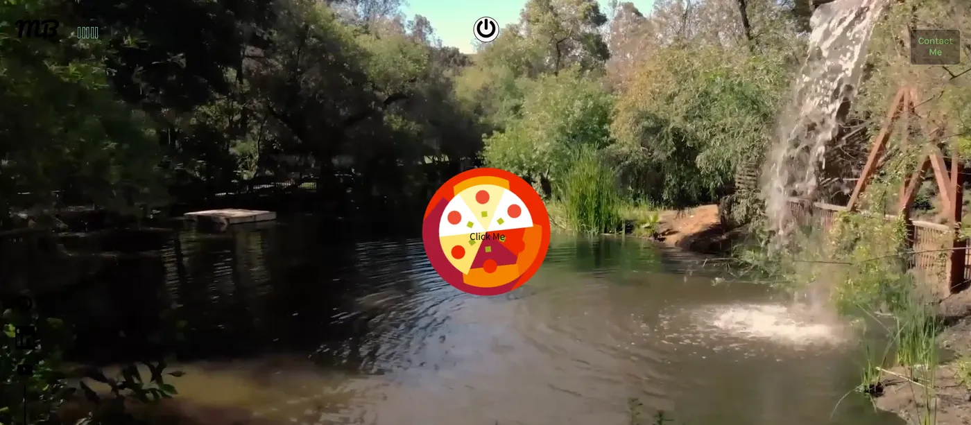
No Three.js in that one, but the instinct was the same one I had this time: a landing page that moves when you touch it and has some personality to it, instead of a header and three cards. The animation was Framer Motion, and getting it to feel right was pure trial and error. Change a value, save, alt-tab, watch it, change it again, and repeat until it stopped looking wrong.
When you’re new to web development, this is where whole weekends go. Making it responsive was worse. Getting that layout to survive a phone screen, in that era, with the CSS I knew at the time, was harder than everything else on the page put together.
Describing what I wanted in words was actually helpful. I knew I wanted some sort of animation with a control to speed up and slow down, but I also knew gimmicky websites like this can create bad UX. That became the one hard requirement in the prompt: this must not trap the user. Writing it down before any code existed meant it got designed around instead of patched in later.
Scrolling up when you’re already at the top of a page does nothing, so capturing it costs you nothing. Scrolling down is only captured while it’s actively slowing him down. Once he’s at a crawl you get about 260 pixels of resistance, and then the page scrolls like a normal page. I’m okay with this as long as the homepage remains minimal.
The build order came with a rule attached: show me each stage before moving to the next. This is one of the reasons I like building my prompts in two phases. Proof-reading a prompt with a second model before the build model ever sees it means it can suggest details like that one. I assumed those gates were there to catch bad output. Mostly they caught me under-specifying. Seeing stage 2 is what told me the camera needed to sit over his shoulder so you can read the laptop screen, and I’d never have thought to ask for that in advance.
On load, the figure snaps his head toward each nav button in turn and the buttons pop in as his glance lands. The snap is a spring, which is what gives you that little overshoot at the end. On my machine it looked great. In the headless test browser, chugging at 9 frames per second, the head rotation ran away to 32,000 radians and the figure turned into abstract art.
Springs do that when frames get slow. Each step overshoots a bit harder than the last until the whole thing detonates. The fix took four lines: stop trusting the frame clock, and chop every frame into slices no longer than a 240th of a second. What matters is that it only turned up because the test machine was slow. It would have shipped, and it would have broken on exactly the cheap laptops and throttled tabs I never test on.
The second one was dumber. The “My Resume” button reported a perfectly
correct position, was in the DOM, was reachable by screen reader, and was
about seven pixels wide on screen. React Three Fiber’s canvas container ships
overflow: hidden, so anything near the edge gets clipped. Found by looking
at a screenshot, diagnosed by measuring element rectangles.
Both of those were caught by tests I didn’t ask for and wouldn’t have written. Screenshots to check framing, scripted wheel events to prove the scroll released in both directions, two screenshots 1.2 seconds apart with their hashes compared to prove the reduced-motion scene was actually frozen and not just sitting still in that instant.
So: pre-LLM I’d have built a worse version of this across a couple months of evenings, shipped the spring bug, and never written the test that catches it. Because at 1am on a personal project you eyeball it, it looks fine on your machine, and you move on.
The part you can’t automate
Then there’s sound. The buttons make noises.. synthesized with oscillators, about forty lines, no audio files, and off by default.
The first pass used a pentatonic scale, so hovering across the four buttons played little ascending notes. Sounds delightful written down. In my ears it was nails on a chalkboard. I said roughly that, and asked if it could be more of a plop, and got back sine waves with a downward pitch sweep. Better. Except now the click sounded like the Roblox “oof,” only deeper. That was my literal feedback for Fable. Third pass: bright cartoon plops, which is what’s on the site now.
Two sentences of feedback total. No numbers, no parameter names, nothing that would survive a code review. That round trip is the part of this project that felt most like 2026 to me: not the code generation, the fact that “this sounds like Roblox but deeper” is now an actionable bug report.
Software development in 2026
I started off with zero idea of what I wanted. I decided to feature a treadmill because I use one. Having a walking stick figure, because ThreeJS is cool. Knowing the pentatonic sound was wrong even though I couldn’t say why. None of that is execution, and all of it is why the site looks like mine and not like a template.
Some numbers, since staying fast was most of the point. Three.js and the scene live in a 908 KB chunk (240 KB gzipped) that doesn’t get fetched until the browser goes idle. The page paints from static HTML before any of it arrives. If WebGL is missing the scene never downloads at all and you get a normal page with normal links. Every content page here, including this one, ships exactly zero JavaScript.
The site is maintained by Opus 5 now, which is where it started. It inherited a documented figure with named joints, five invariants it isn’t allowed to break, and a list of every bug that already cost an hour.
Cost Breakdown (August 2026)
As of writing this blog post and shipping this site, the total cost was $42.30 which went towards using Fable 5.
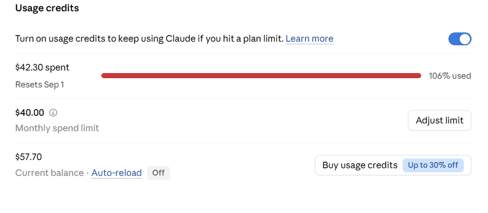
What I’m most curious about is how Anthropic’s pricing model will adapt. It may cost me $40 to build a solid personal website today - but will that become more or less expensive in the future? I’m not here to make predictions. If we do reach a point where we fully rely on GenAI for software development, I want to know if my personal wallet can still afford it.
In August of 2026, this cost $42.30. I don’t know what that number looks like in August 2027, or 2030. Maybe token prices keep falling the way compute usually has, and a site like this becomes a rounding error - a few cents, then free, then just baked into the cost of a domain name. Or maybe it goes the other way: the frontier model is always the one you actually want to use, and the frontier never gets cheap, even as everything behind it does. That’s roughly how it’s worked for CPUs, GPUs, bandwidth - the good stuff stays expensive by staying new.
Closing Thoughts
$42.30 was the total cost of this website.
Was it worth it? Absolutely.
Do I feel a little guilty that I didn’t write a single line of code? Yes.
As I lean into these tools on personal projects and at work, I’m still learning the new balance: using AI for speed without surrendering the judgment that belongs in code reviews, design discussions, and incident post-mortems. That scrutiny isn’t optional - it’s the part of the job that still requires a human in the loop.
I hear developers complain: The satisfaction of solving that bug has been taken away. That may be true, but the analogy I like to use is the difference between walking to a destination versus driving.
Walking, you learn the terrain. You notice the shortcut through the alley, the hill that wears you out, the pothole that’s been there for years. Driving, you learn none of that - you just get there faster. Neither is wrong. It depends on what you’re optimizing for, and most days I’d rather arrive.
But nobody drives with their hands off the wheel. The car covers the distance; you still decide when to slow down, when to double-check the mirror, when to pull over because something feels off. That’s the part I’m not willing to hand over, and it’s also the part nobody mentions when they talk about vibe coding a website in a weekend.
So yes - $42.30 bought me a site I didn’t write. It also bought me a few hundred small decisions about what to accept, what to push back on, and what to rewrite myself. That’s still the job. It’s just a different commute.